Accessibility Testing - Top 10 Highlights from our Shaw Trust Testing Trip.
Published by
Heather Stroud
on
Web accessibility. A statement you may hear often, but what does it really mean?
To sum it up, web accessibility refers to the accessibility and usability of a computer system, the internet and installable software, to all people regardless of disability type or severity of the impairment. At Jadu, accessibility is at the forefront of our organisation. Technology is a big part of everyday life and everybody has the right to access a computer for independent use. As content creators, we have a responsibility to offer inclusive and easy-to-use content for all of our users.
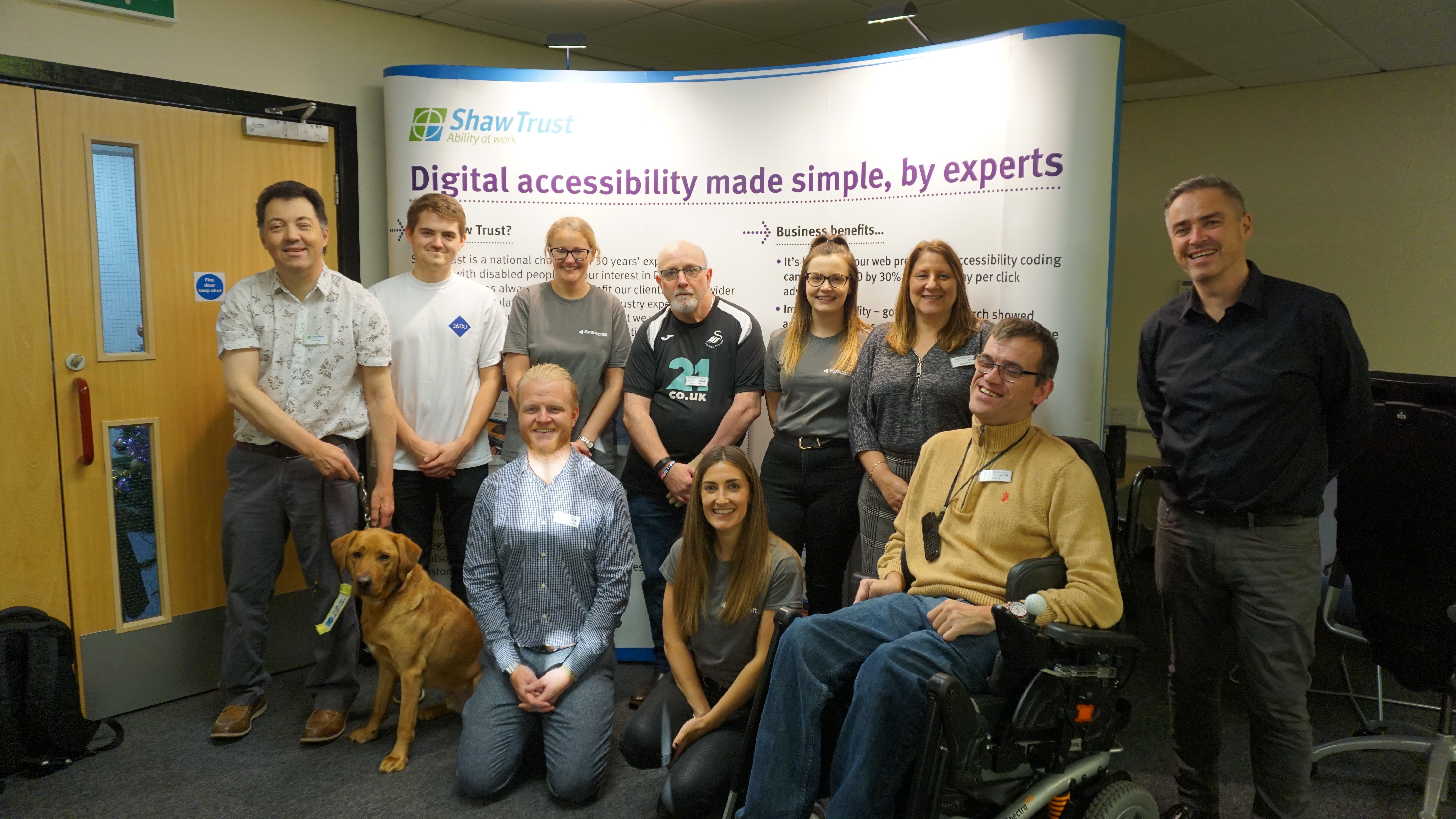
Some of the Jadu team were lucky enough to spend the day with Shaw Trust Accessibility Services, an organisation that supports the private, public and charitable sectors to create an accessible environment, both digitally and physically. Luke Towers, Test Engineer, and Heather Stroud, Test Team Leader, had the opportunity to work with some of the Shaw Trust testers to find out how they can improve their accessibility testing criteria.
Here are the top 10 highlights Heather learned from a testing perspective on the trip:
In December 2019, my colleague Luke and I spent the day with the testing team at Shaw Trust. We went with the aim of checking our WCAG 2.1 testing approach and also to see what gaps we had and where we could make improvements.
Our hosts, Joe and Julie, along with expert testers Alan, Kevin, Darren, Adam and Lee, worked on a sample of Jadu Creative's websites. We came back with recommendations of good practice, some content potholes and new items we could expand our testing suite with. Here are the top 10 highlights:
- Having skip to links isn’t that helpful if they don’t skip very far
These skip-to’s are good practice and a WCAG 2.1 requirement, but by implementing them by rote rather than considering their aim and relevance to each design can defeat their purpose. If the skip to navigation link only takes you one step down the page, is it worth it? Is there another part of the page that would benefit more from a skip to instead?
We are now reviewing skip to links in all-new Jadu Spacecraft design projects on a case-by-case basis to ensure they are relevant and effective.
- The accessibility statement is really important!
The testers shared that this statement is where many users will visit first. It needs to have any elements of your site that can assist users or any areas that they need to know might cause problems (e.g. historic pdfs, legacy service areas). Be sure to shout here too about the services you are offering (e.g. British Sign Language, language interpreters, alternative document formats on request etc). - . . .and so are easy links to it and your contact page
Making the accessibility statement and contact page super useful won’t maximise the benefits they can give if the links to them are hidden somewhere in menus. Have them prominently linked to from as many pages as possible. - Have an alternative contact option for deaf users . . .
If you only have a phone number or call back option on the contact page you could be excluding some members of the deaf community from your services. Have another facility they can use. - . . .. or consider using a service like Relay UK or SignVideo
- The help text position is important for screen reader users
An example is using an online form. If a form field has help text underneath the field, i.e. instructive notes on how to fill out the field, it may be read out too late which is frustrating for the screen reader user. They may have already completed that field by the time they hear the help text readout. - Just how useful headings are for screen reader users
We knew that having the correct heading structure was a WCAG 2.0 guidance point, but seeing users primarily navigating the page this way was still revealing. Watching users pause when they found a skipped heading to work out if the problem was theirs or with the content they were accessing demonstrated exactly why the structure mattered.
It also showed how setting up the content correctly can really help users who first listen to the page at a high level via the headers alone. They do this to identify the area they’re most interested in and speed up their user journey. For these users particularly, it’s vital that content editors make headings relevant and descriptive.
- Don’t forget the accessibility page when keeping content fresh and up to date
Having videos with signed content, or captioned, on the accessibility page is brilliant and really useful to the user. But remember, videos have shelf lives when content isn’t updated it reduces the impact of the page. - Be aware that your third party services can let you down
Our expert users had moments when they were sailing along on a site and all was well until they suddenly hit a problem. Keyboard navigation didn’t work anymore or the font size was suddenly small and harder to read. This was usually because they’d been transferred to a third party site - often to make a booking or payment. - Seeing real users interact with your design and content is important
We follow the guidelines closely. We make sure our designs are as inclusive as possible. But to see some of the Shaw Trust users demonstrate why we do this and the examples they gave us to improve our services and refocus us on user experience was important. We’ve updated and widened our test cases and are enthused to champion inclusivity for all our work.
Tags:
Accessibility category
Leave a comment